Building a scalable architecture for digital banks


Competitive analysis
A quick analysis of similar apps globally uncovers the following trends:
The grid – Arranging all activities in a grid-style arrangement on the primary screen;
Bottom navigation – Distinguishing essential operations and guaranteeing simple accessibility in the lower navigation
Nonetheless, as you delve deeper, you start to observe the lack of meticulous deliberation involved in these decisions. Moreover, you discern that the architecture doesn't possess scalability.
The grid method
Even though its adaptability can be tailored to your preference, each component here requires attention.

You additionally encounter issues when you want a specific item to be prominent, such as a 5% discount on electricity and other expenses.
The team commences with a single discount pill and ultimately faces a plethora of challenges in emphasizing unique selling points or markdowns.

The bottom navigation
The bottom navigation seems moderately enhanced; however, the lack of thought given to the placement of specific components here is clear. Here are several of the lower nav options we came across.

A noticeable absence of consideration is evident regarding elements like help or account being placed in the bottom navigation - more suitable locations for these on the homepage can be found. Such decisions prove to be more challenging, making the bottom navigation less adaptable in the long run. Some choices seemingly appear as though somebody placed them there simply because they couldn't find a more appropriate spot for the service/product.
Next steps
Following our first examination, we developed several variations. The primary objective of this reorganization was to enhance scalability. We were aware of our future expansion into product categories such as savings and investments, which played a crucial part in our redesign along with our users' intention of having quick access to these products/services.


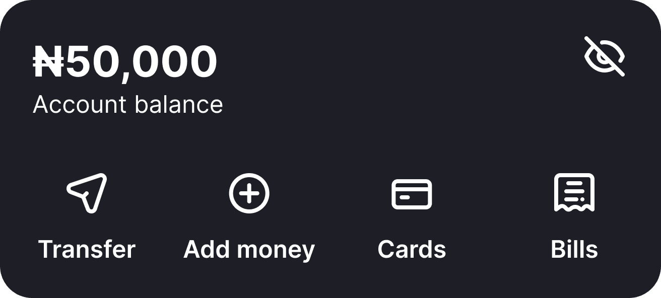
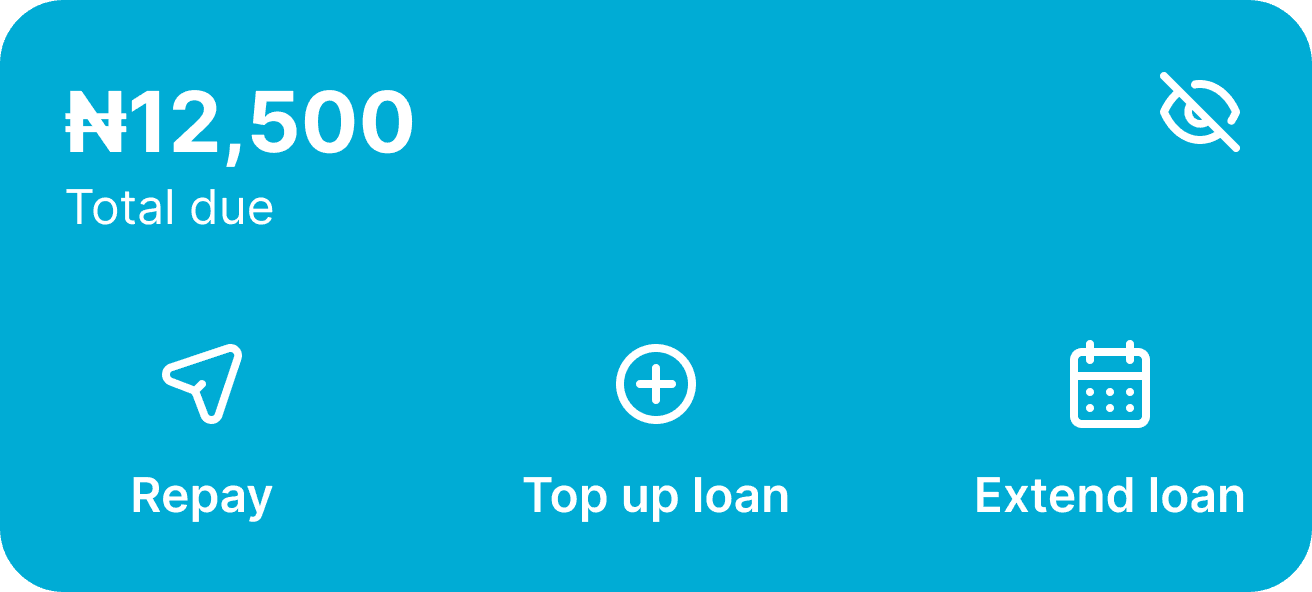
We also discovered that rapid accessibility and actions for various product categories could be more challenging with the aforementioned strategies. Thus, we opted for a bottom navigation method, where each element on the bottom navigation serves as a foundation for banking. We supplemented this with top cards, which display users' balances and provide swift entry to the relevant product categories.
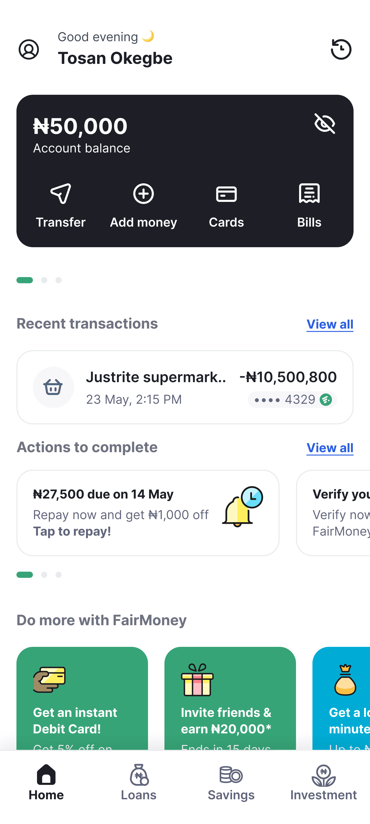


4 top cards with respective balances, and a bottom navigation for each of the banking categories


Each category gets it home
Breaking down the structure


Quick action cards ⤴
All accounts, balances, and swift actions collectively, our users specifically requested this, so we ensured its integration
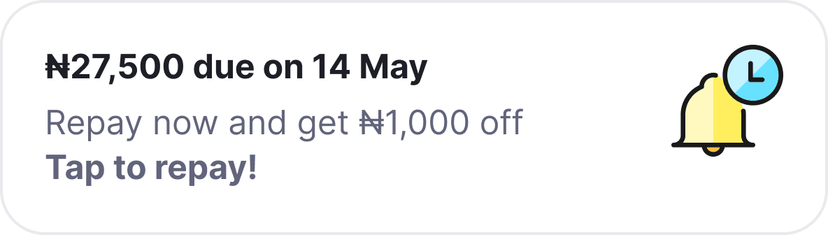


Reminders and notifications ⤴
Combined all urgent reminders and actions under one section


Cross sell ⤴
An exclusive section for everything cross-sell - handling every special deal and promotion

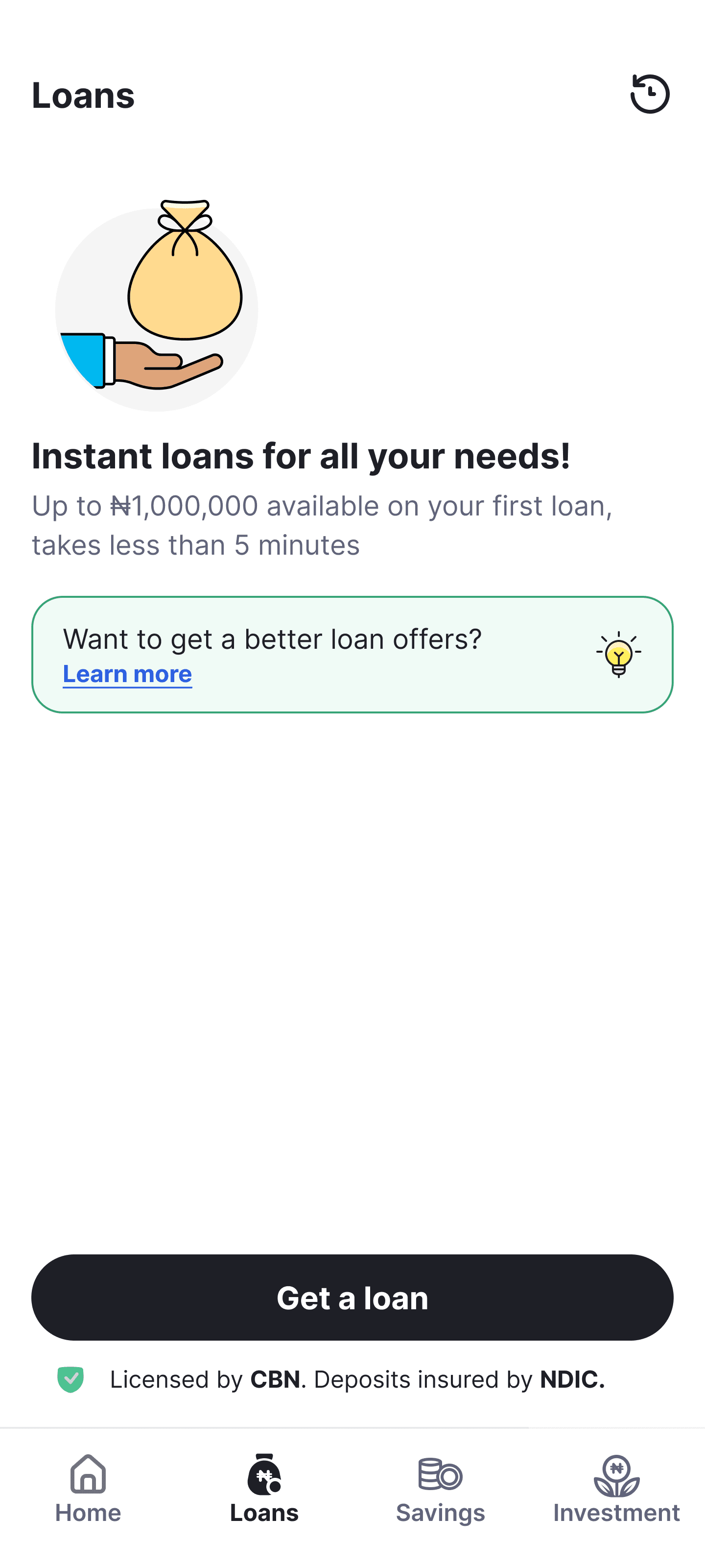
Bottom navigation ⤴
Bottom navigation to enable quick toggling between different products

Expanding lower navigation to encompass additional product categories ⤴
Way forward
The new framework enables FairMoney to effortlessly expand to 6-7 product categories without the concern of a redesign – at least not an IA overhaul. So far, the users are thrilled with this new structure, and it has simplified the process for users to locate and engage with our product (this is founded on both data and research).