Building a scalable architecture for digital banks
Coming in as a design leader, my role at FairMoney was to build the team, establish the creative direction and processes that will help scale the loan-only app into a full fledged digital banking app.
First steps
The first steps in creating a new direction was to convince management that we needed a more scalable model and rethink the information architecture of the app. The current approach of introducing new product mostly relied on creating a banner on the home page which worked for a couple of products but was not scalable.
Next was to work with the research team and do a completive analysis to show how competitors are solving the problem globally. Once research was done the design team collaboratively worked on multiple architectures which were later discussed with management to align on a vision for FairMoney.
After this vision alignment, the next step was execution. Working with the CPO we decided to break down the end goal into smaller chunks and release them slowly.
In order of importance the following features were prioritized:
Home page - Complete redesign and revamp
Loan home - Create a new home for loans and address the current drop offs in the loan application funnel
Banking features - transfers, top ups, and other services
Savings home and related flows
Revamp of the remaining parts of the app
Insurance, stocks and crypto would come in later as they were prioritised based business and product needs
Moving towards the end goal slowly we revamped the entire app and each category got its own home.
End result
While the results cannot be quantified in terms of actual numbers I observed the following changes in the organisation:
Time to roll out new features reduced as the new architecture allowed to plug in features with ease as most of the things had already been thought off
Users reported ease in using the new designs and appreciated the change
Clear demarkation between different banking pillars made it easy for the users to navigate the app and keep track of their money
4 top cards with respective balances, and a bottom navigation for each of the banking categories

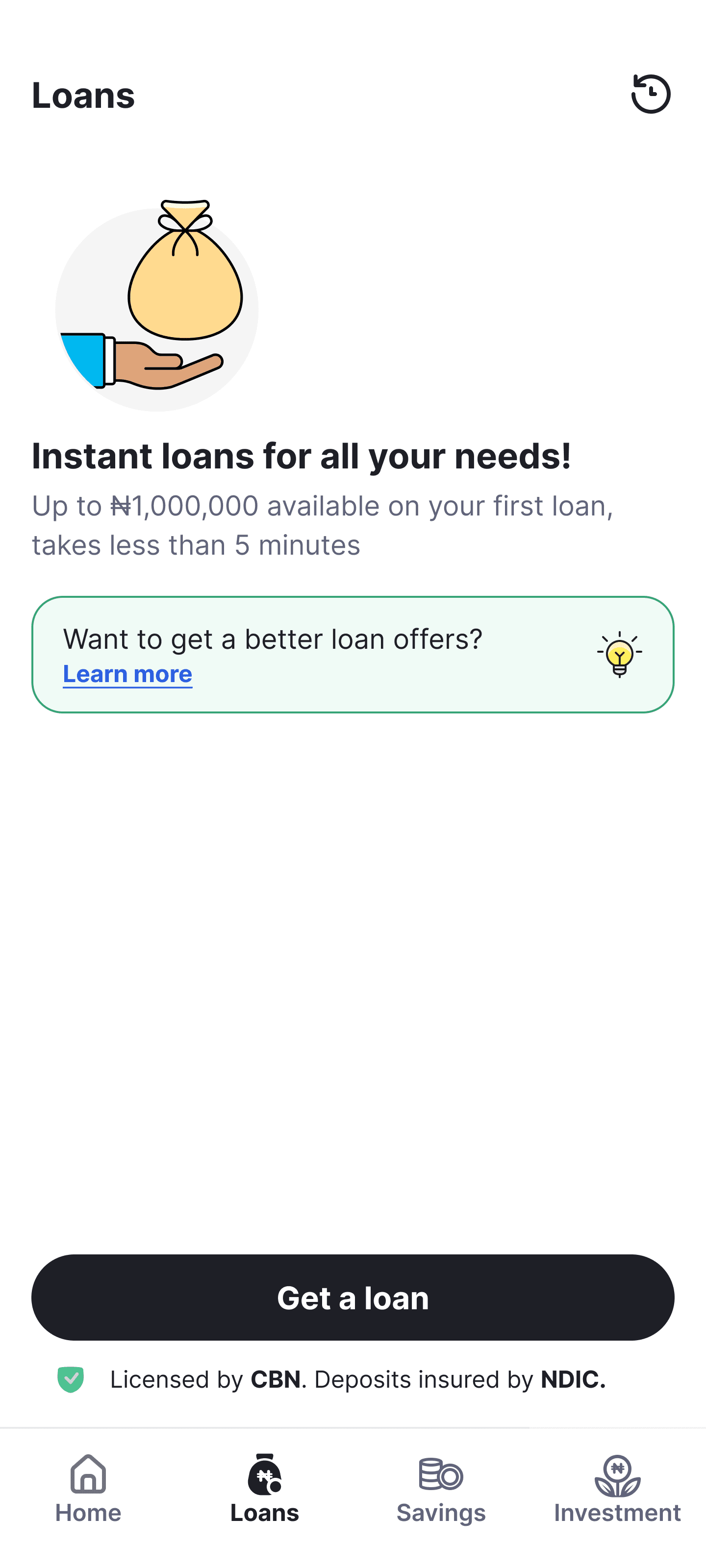

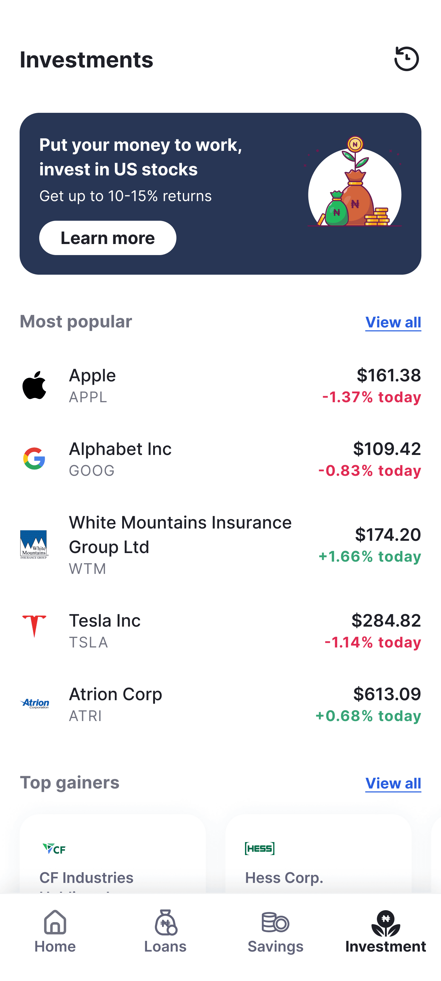
Each category gets it home
Breaking down the structure
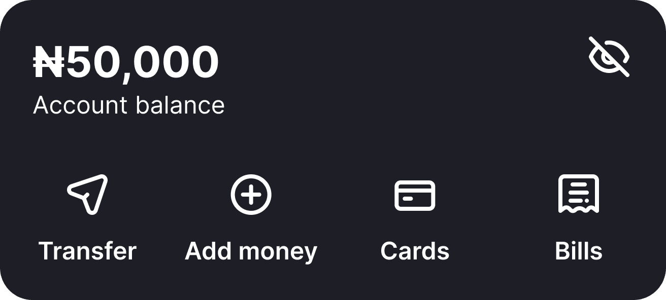
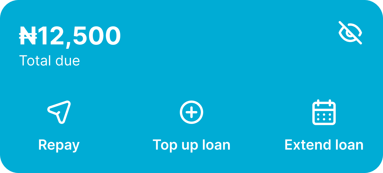


Quick action cards ⤴
All accounts, balances, and swift actions collectively, our users specifically requested this, so we ensured its integration


Reminders and notifications ⤴
Combined all urgent reminders and actions under one section





Cross sell ⤴
An exclusive section for everything cross-sell - handling every special deal and promotion

Bottom navigation ⤴
Bottom navigation to enable quick toggling between different products

Expanding lower navigation to encompass additional product categories ⤴


